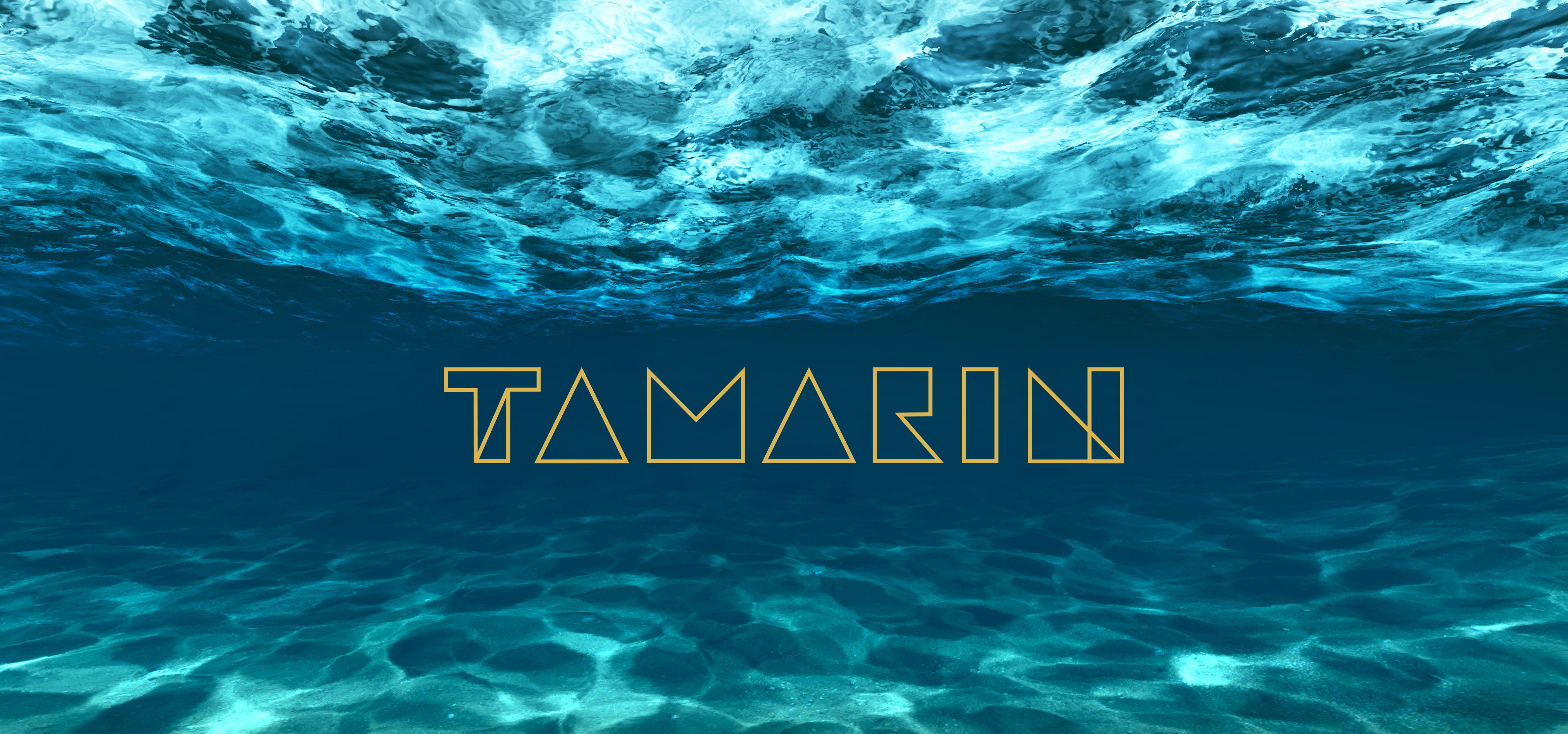
INSPIRATION
Color - I like to be surrounded by colors.
I gravitate towards blues for their calm
and tranquil nature but I also like their
complementary colors of oranges/yellows
for their energizing/positive qualities.
I gravitate towards blues for their calm
and tranquil nature but I also like their
complementary colors of oranges/yellows
for their energizing/positive qualities.
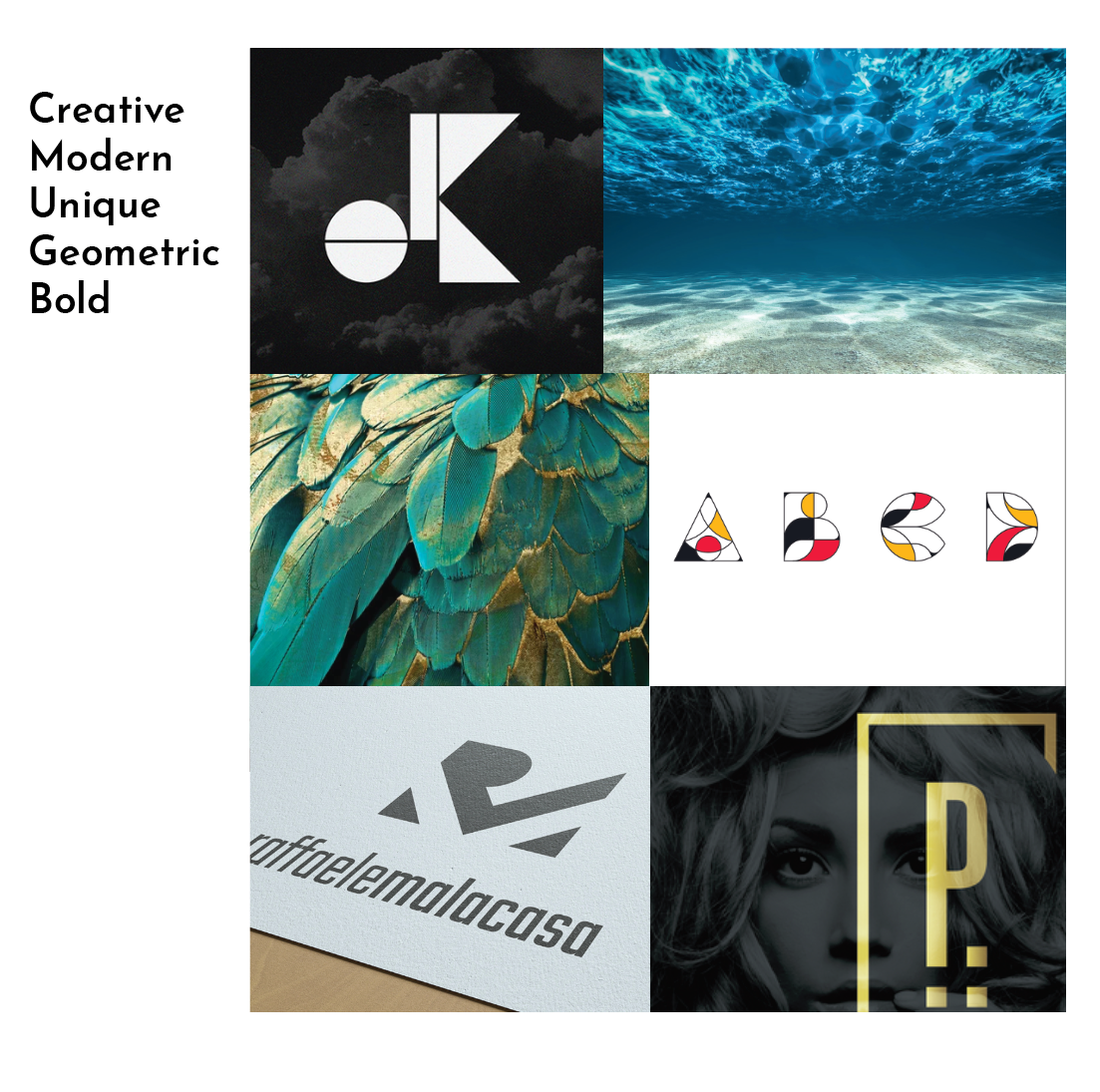
Typography - elegant and unique
Style - I like when there is a play with
the figure/ground. I like design that
makes me take a second glance for
its intrigue.
the figure/ground. I like design that
makes me take a second glance for
its intrigue.

SKETCHES
I drew thumbnail sketches of my full name, just the letter T, and many different icons to symbolize my brand. The thumbnails I gravitated to were the ones of blocked out shapes of my name.
VECTOR ITERATIONS 1
I explored using typographic shapes of the counters and stems to experiment with the positive and negative space.
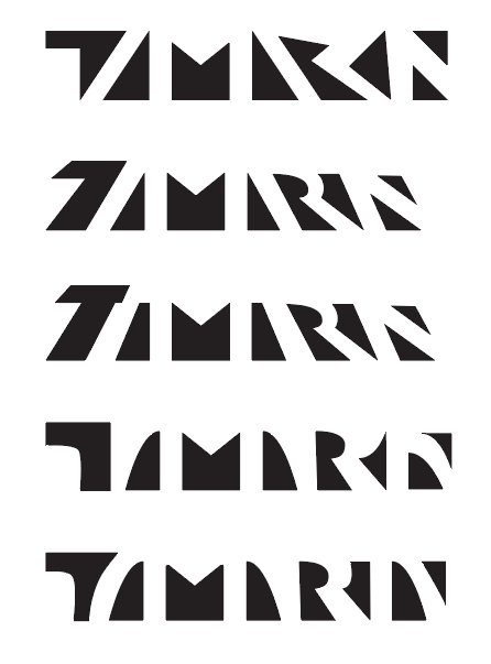

VECTOR ITERATIONS 2
I chose to simplify each character into basic shapes or block versions. I created cohesion by a unified width and similar angles. Readability became more of the goal. I liked how the majority of the letters were developing except for the T and the R. I played around with these letters until they melded well with the others.
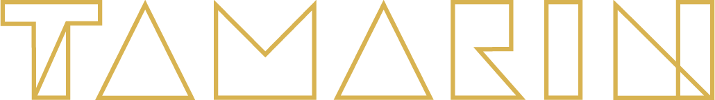
The final version of the logo, I decided to use just the outlines of the letter forms to be more unique and delicate. The older iterations came across as blocky and heavy. I wanted a stylized emphasis on the T and the N since they are the first and letters of my name but also are in my initials. It also creates a continuity of an upward triangular movement that can symbolize my growth as a designer.
Image credits
underwater photo : © auimeesri /Adobe Stock